top of page
Ceniza Amaya
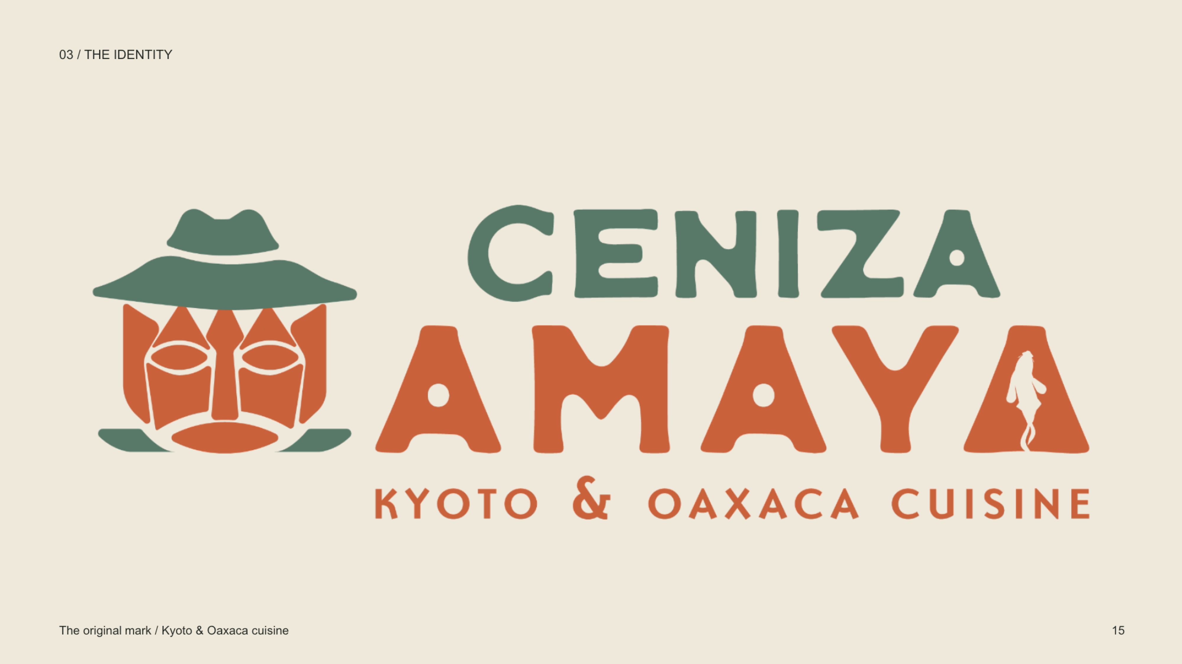
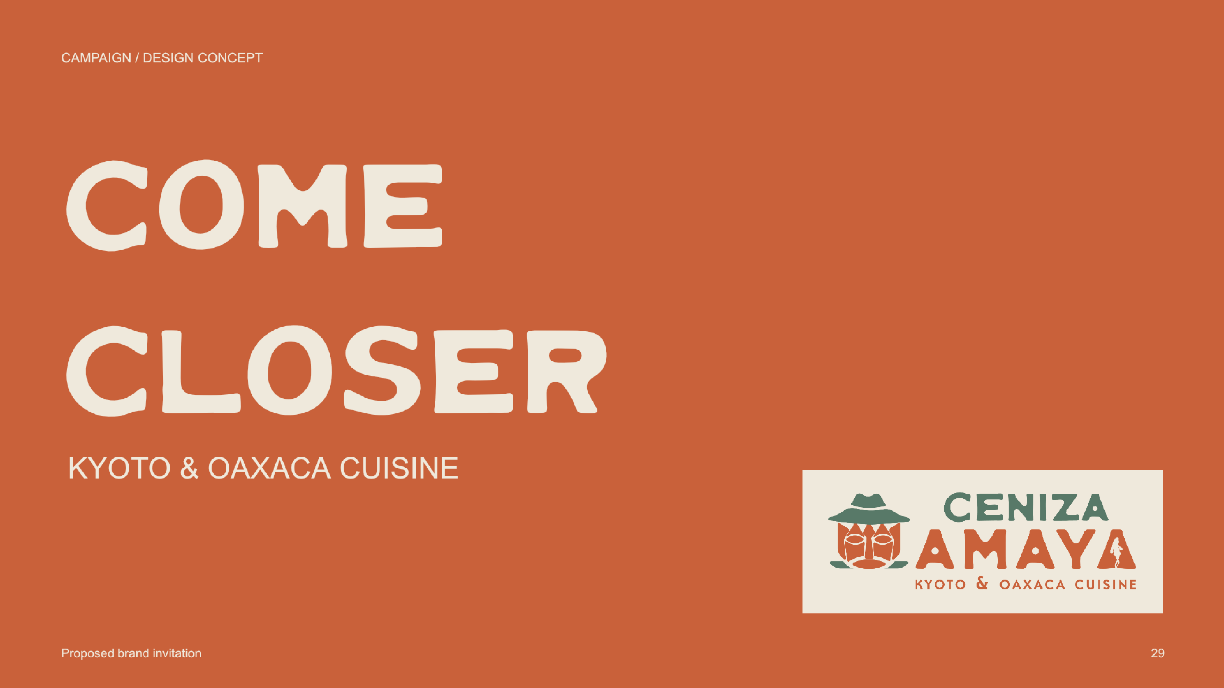
Ceniza Amaya brings the culinary traditions of Kyoto and Oaxaca into conversation through a visual identity shaped by food, craft, and place.
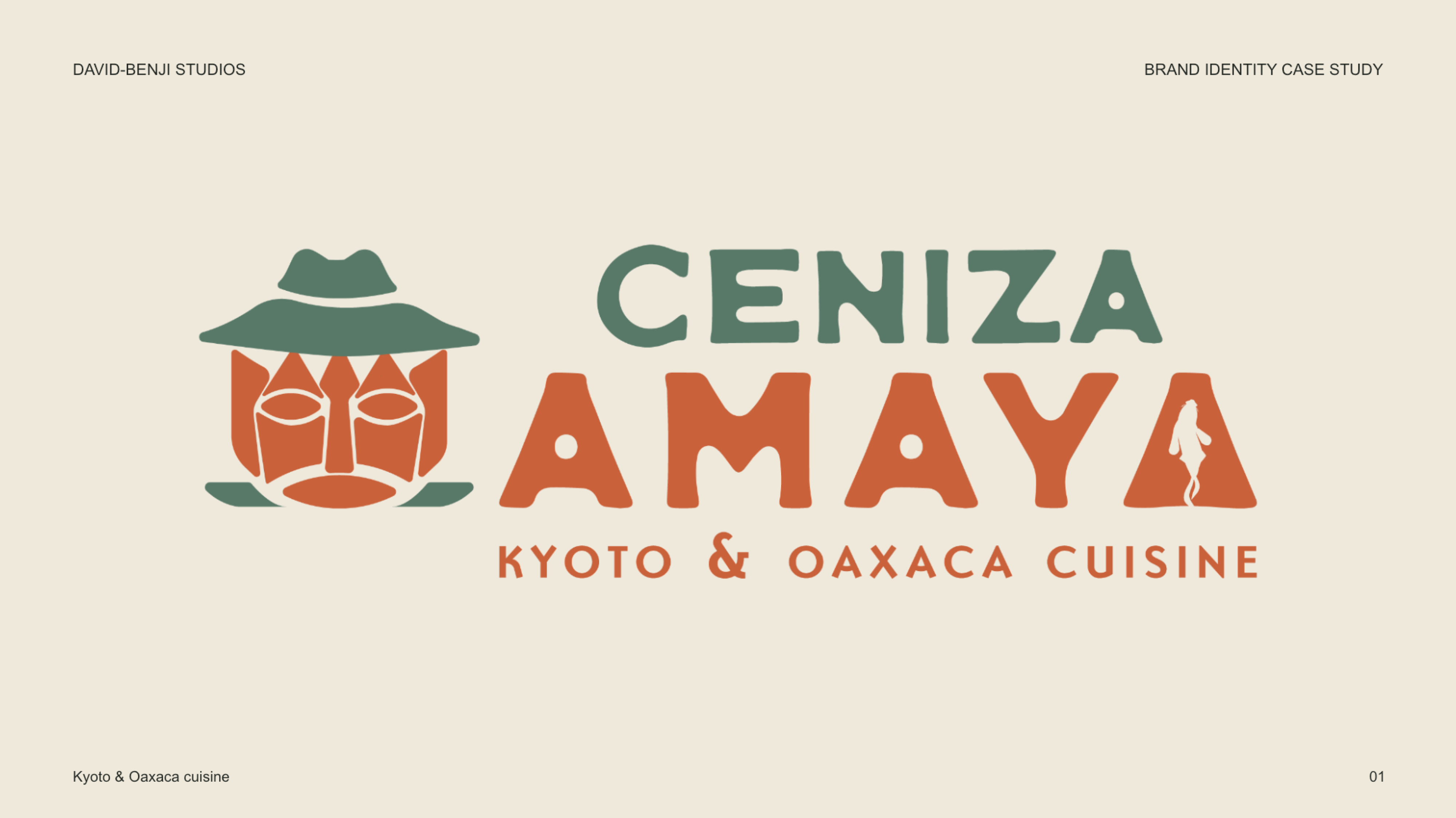
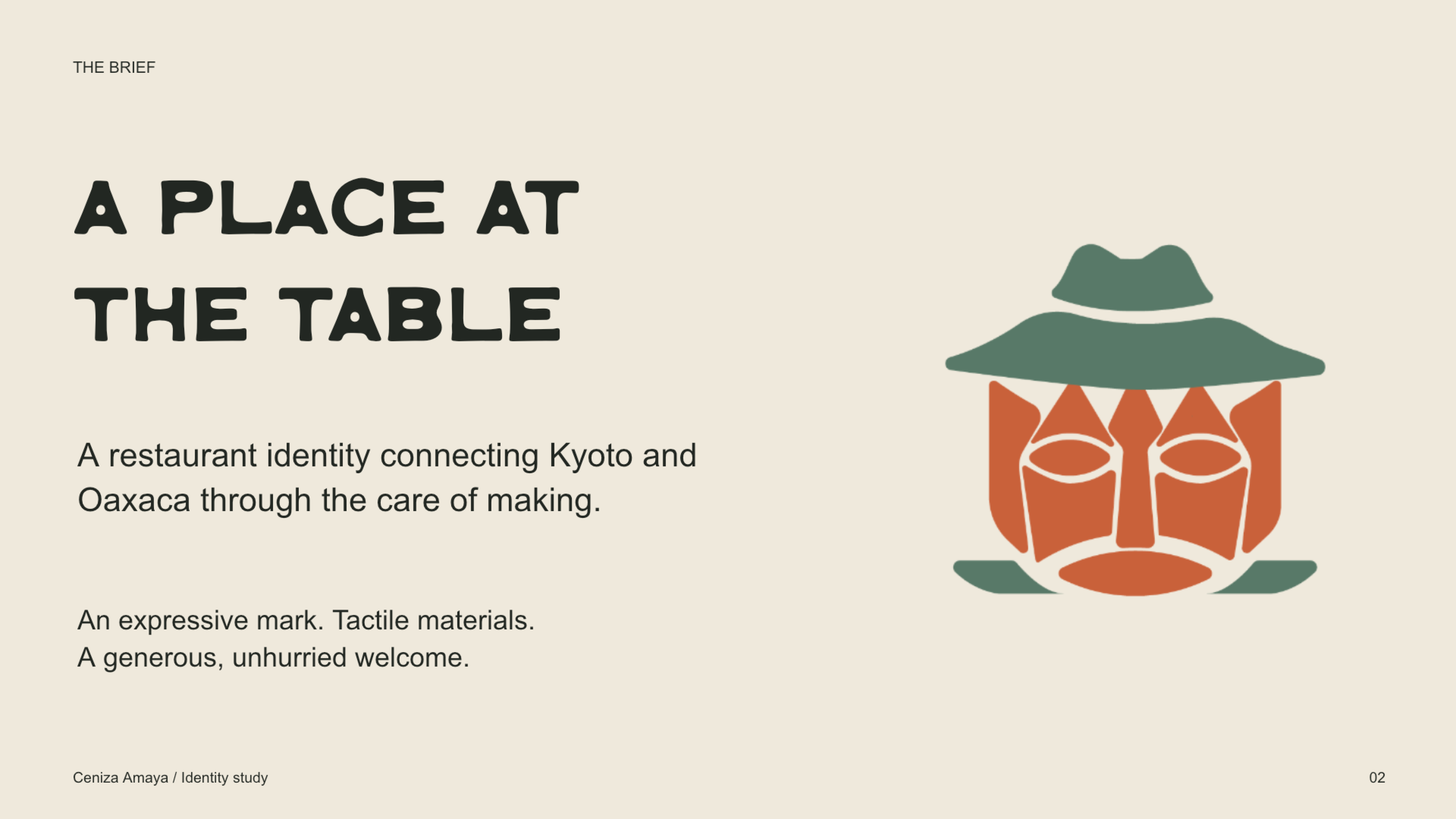
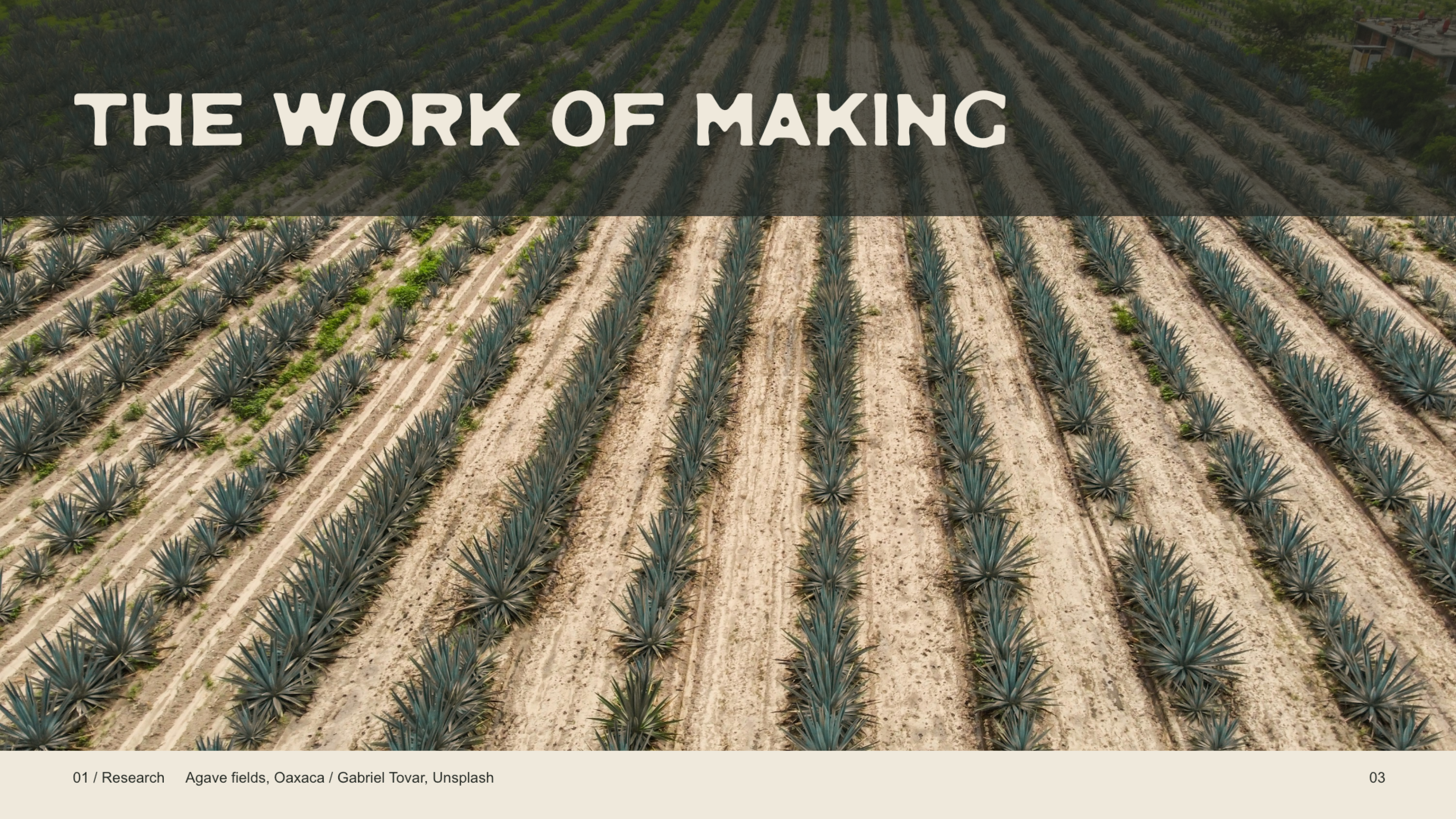
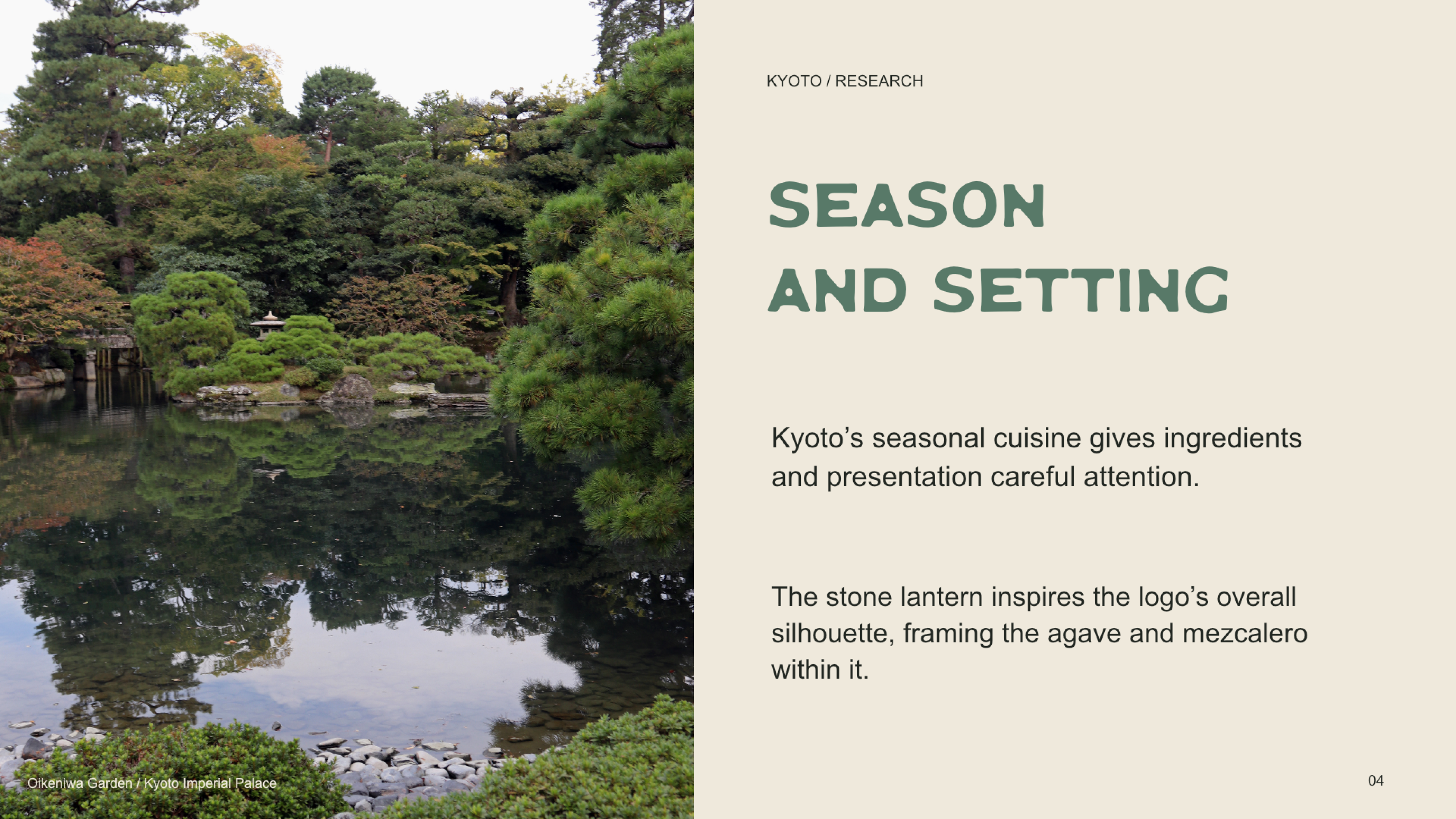
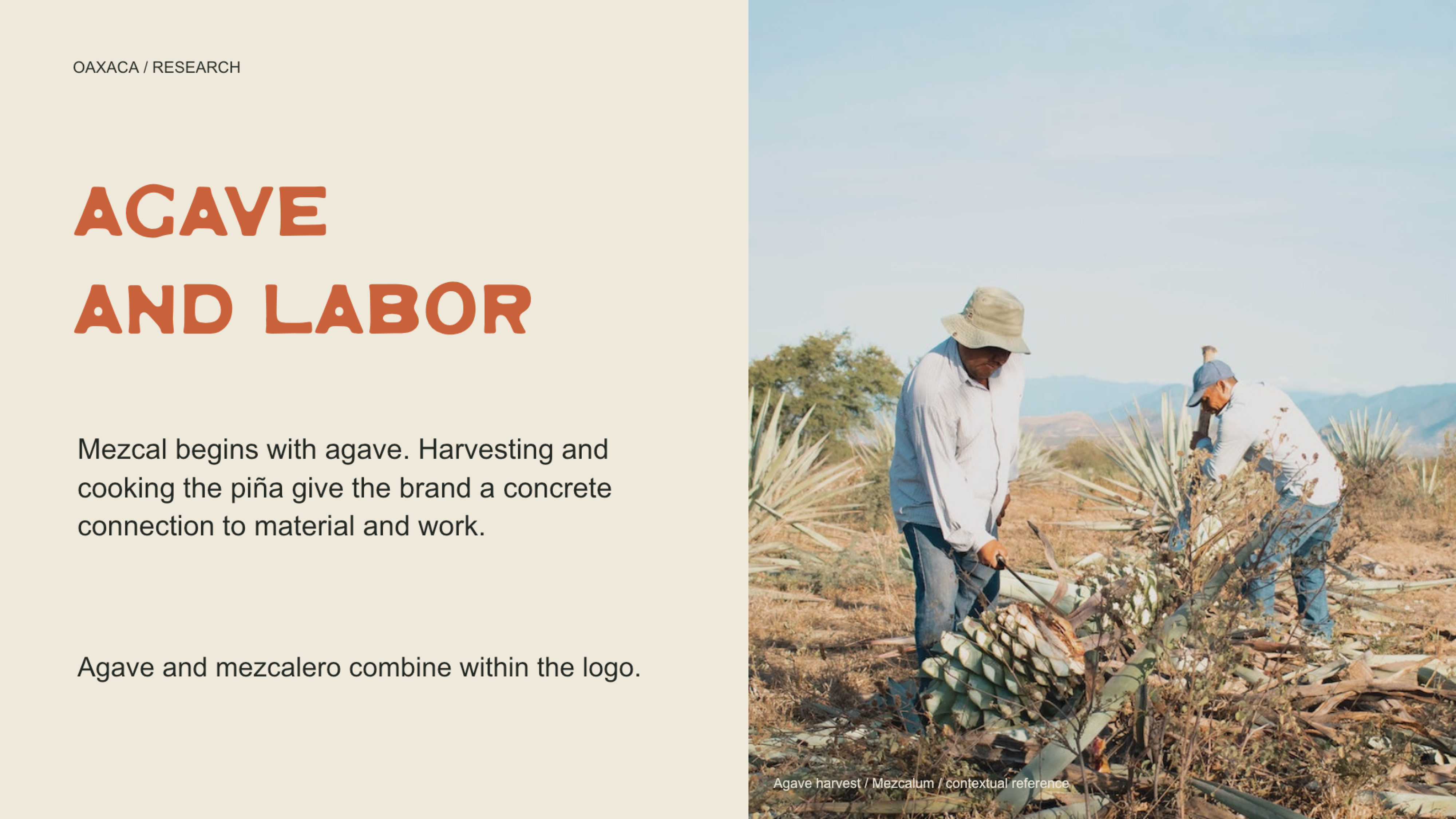
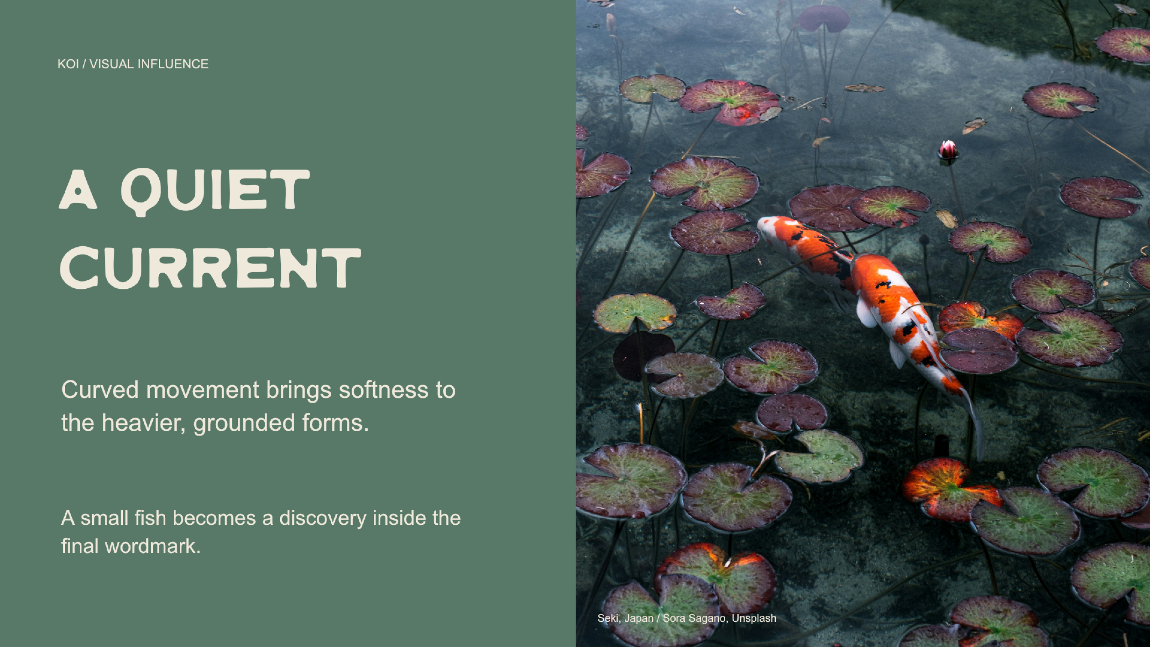
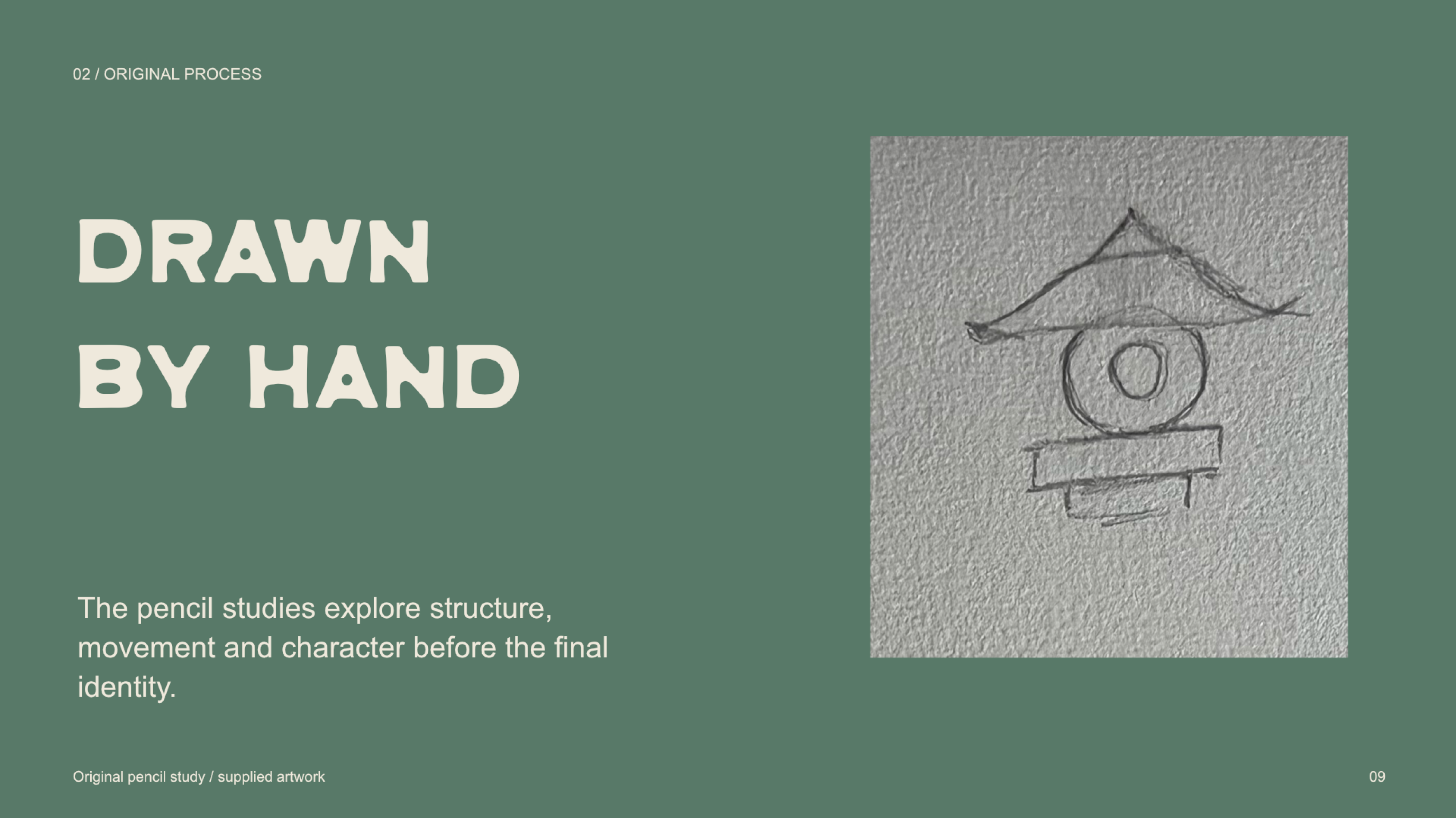
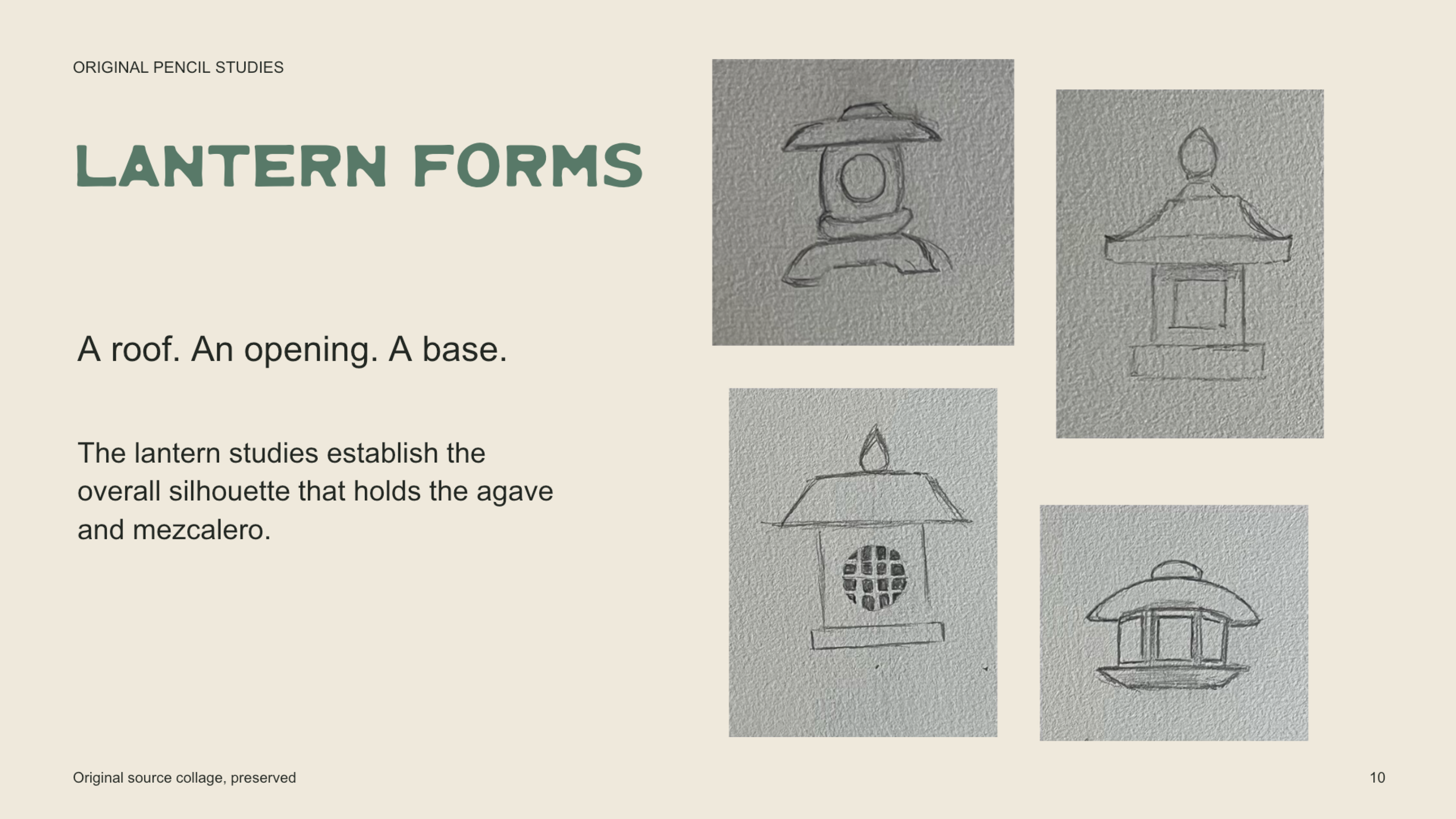
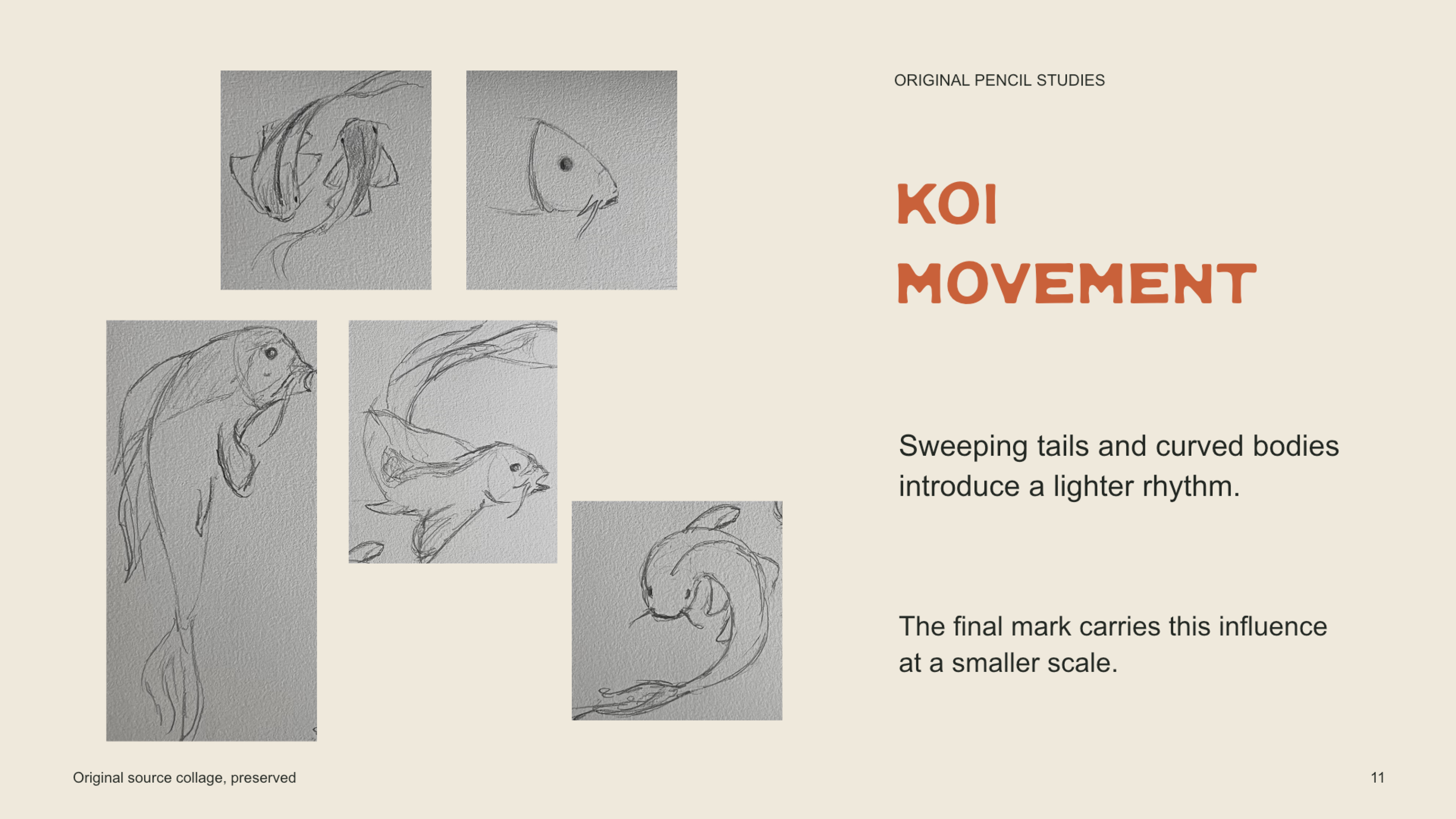
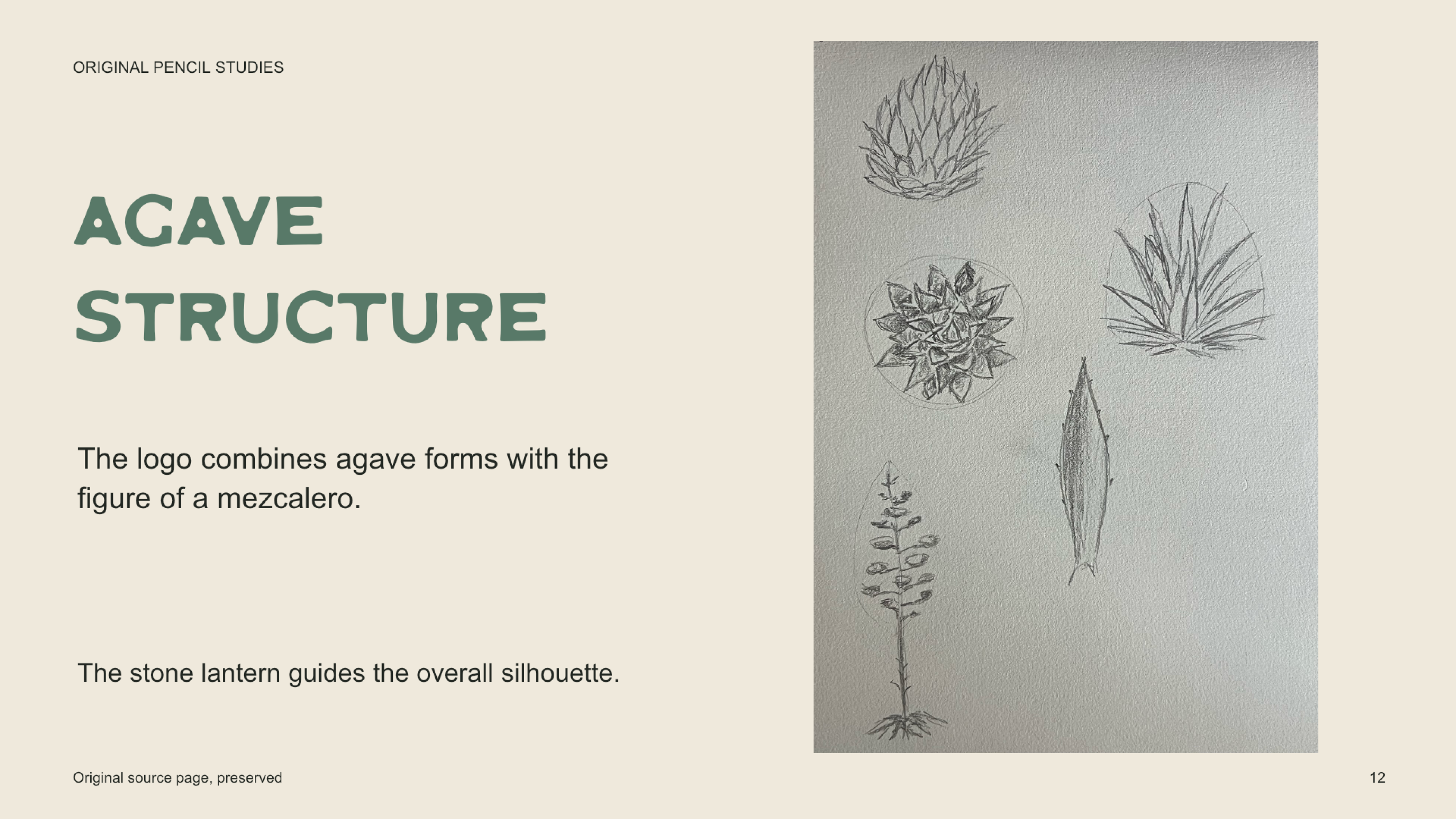
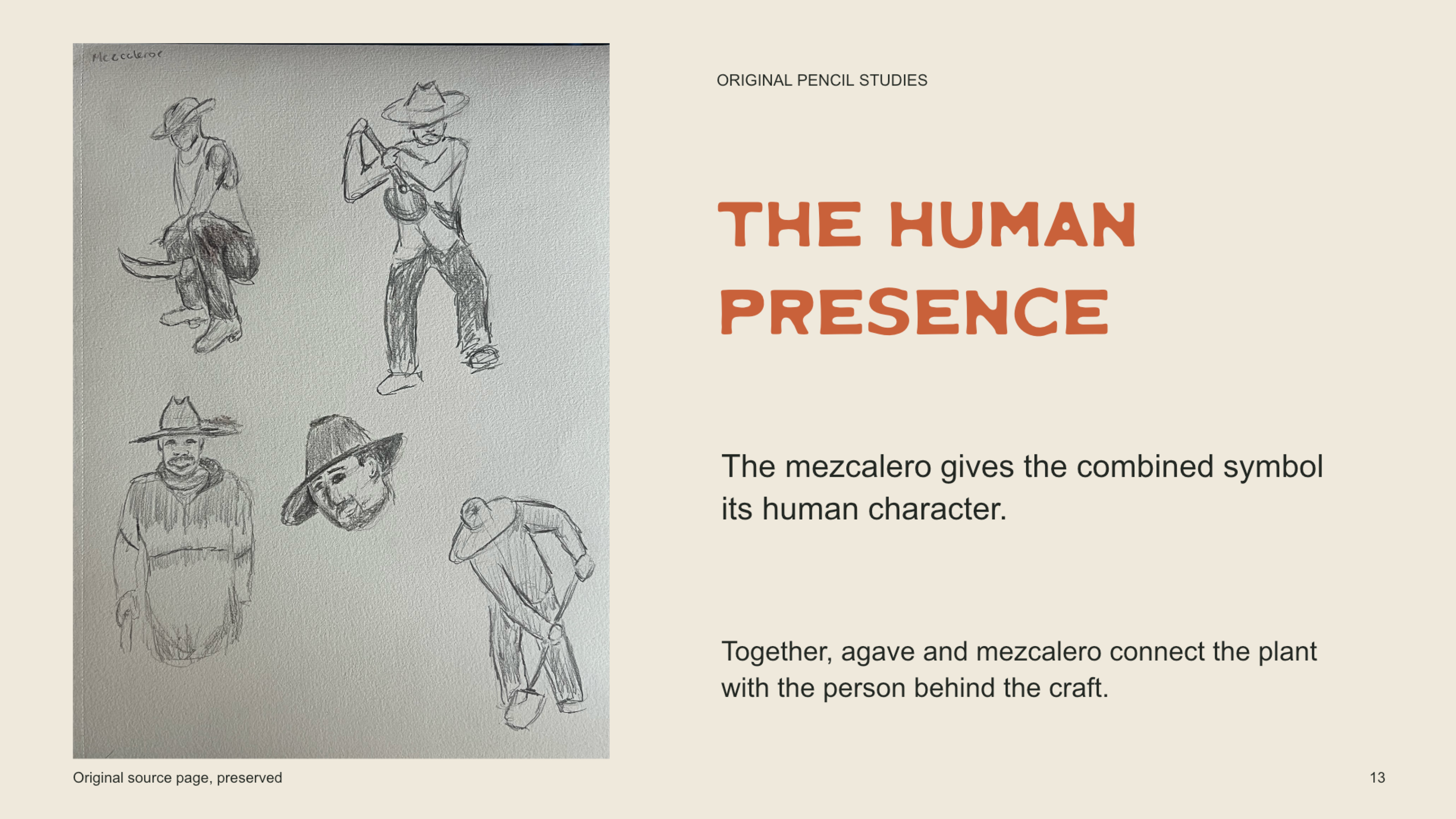
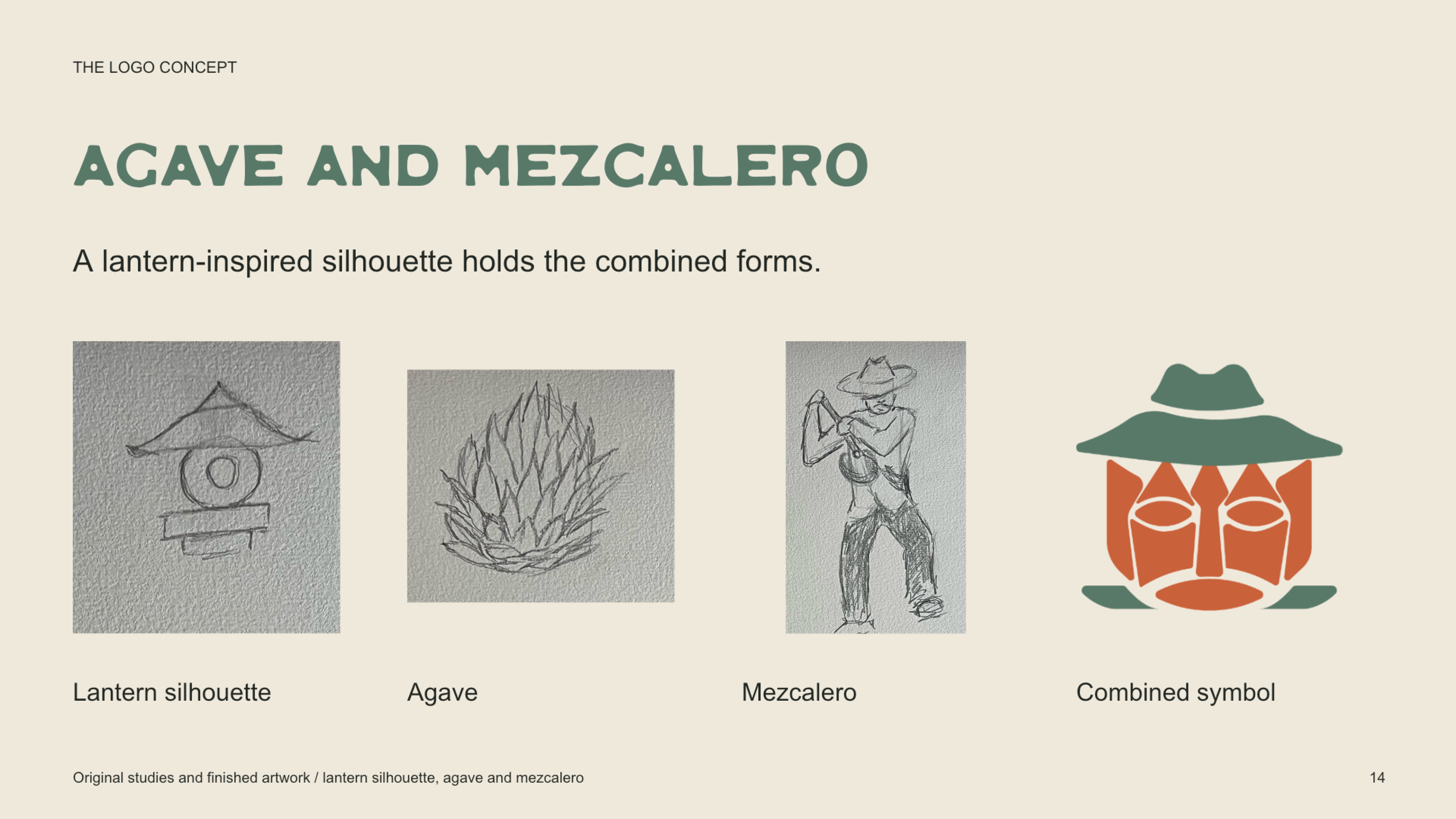
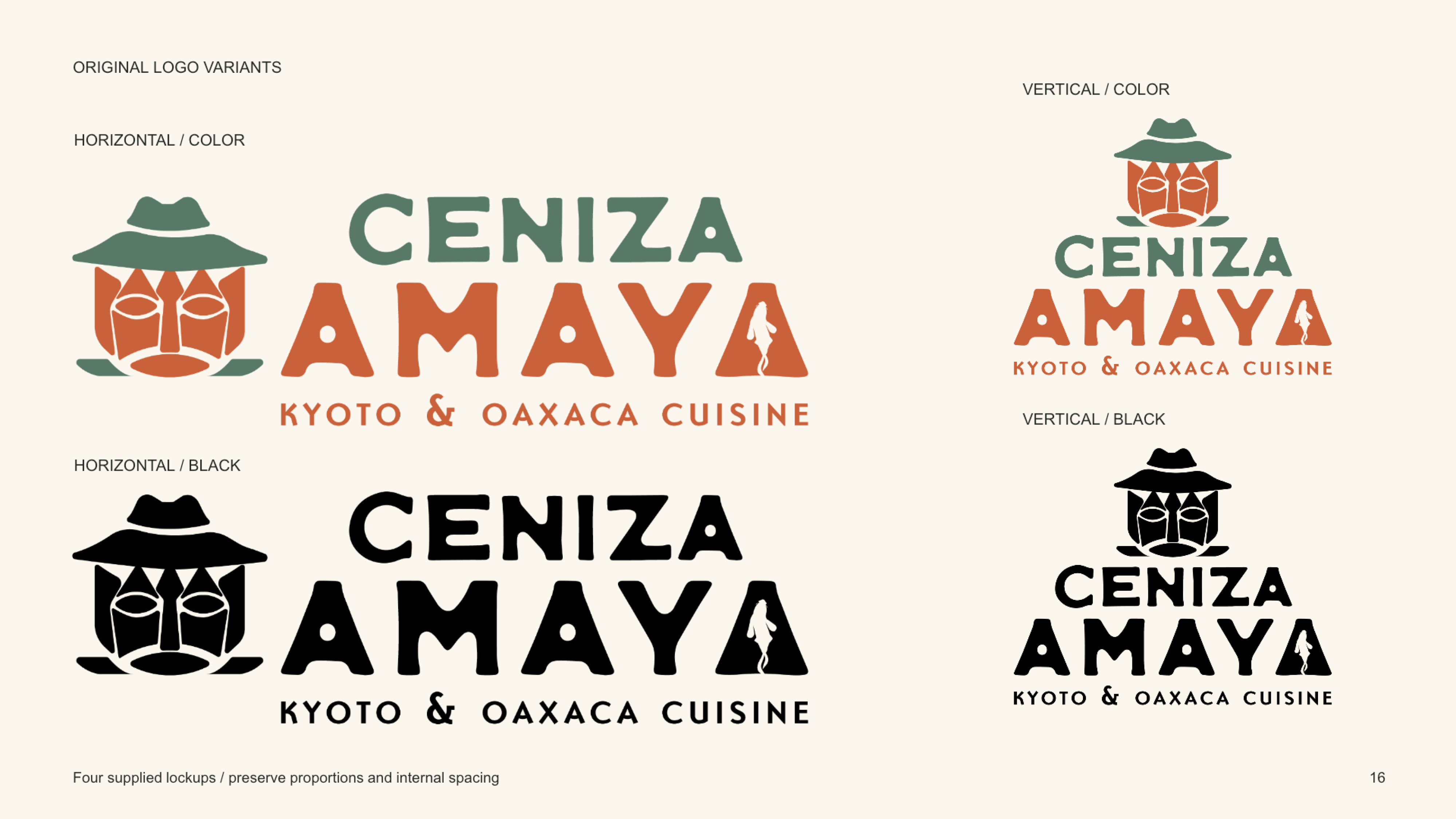
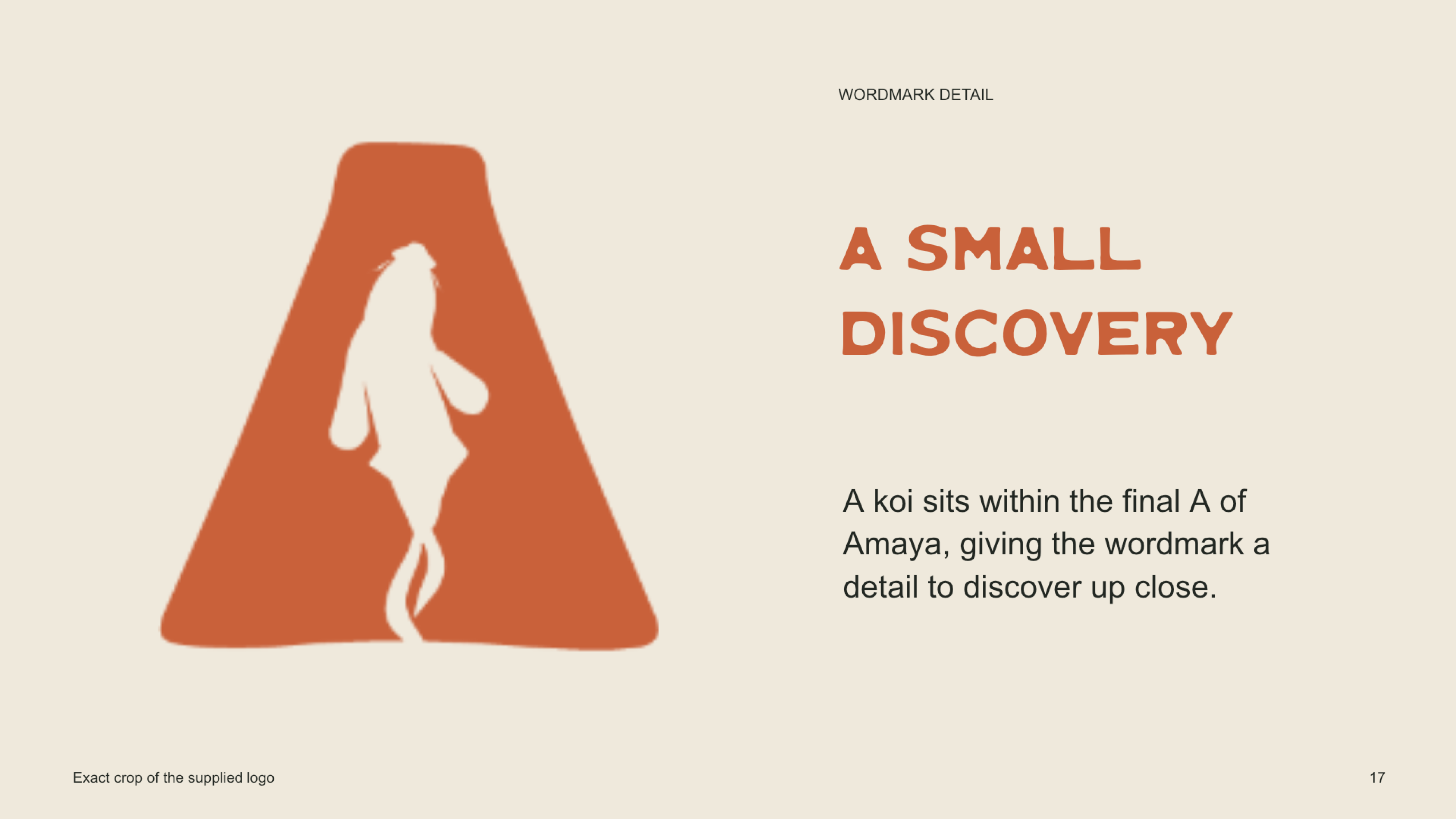
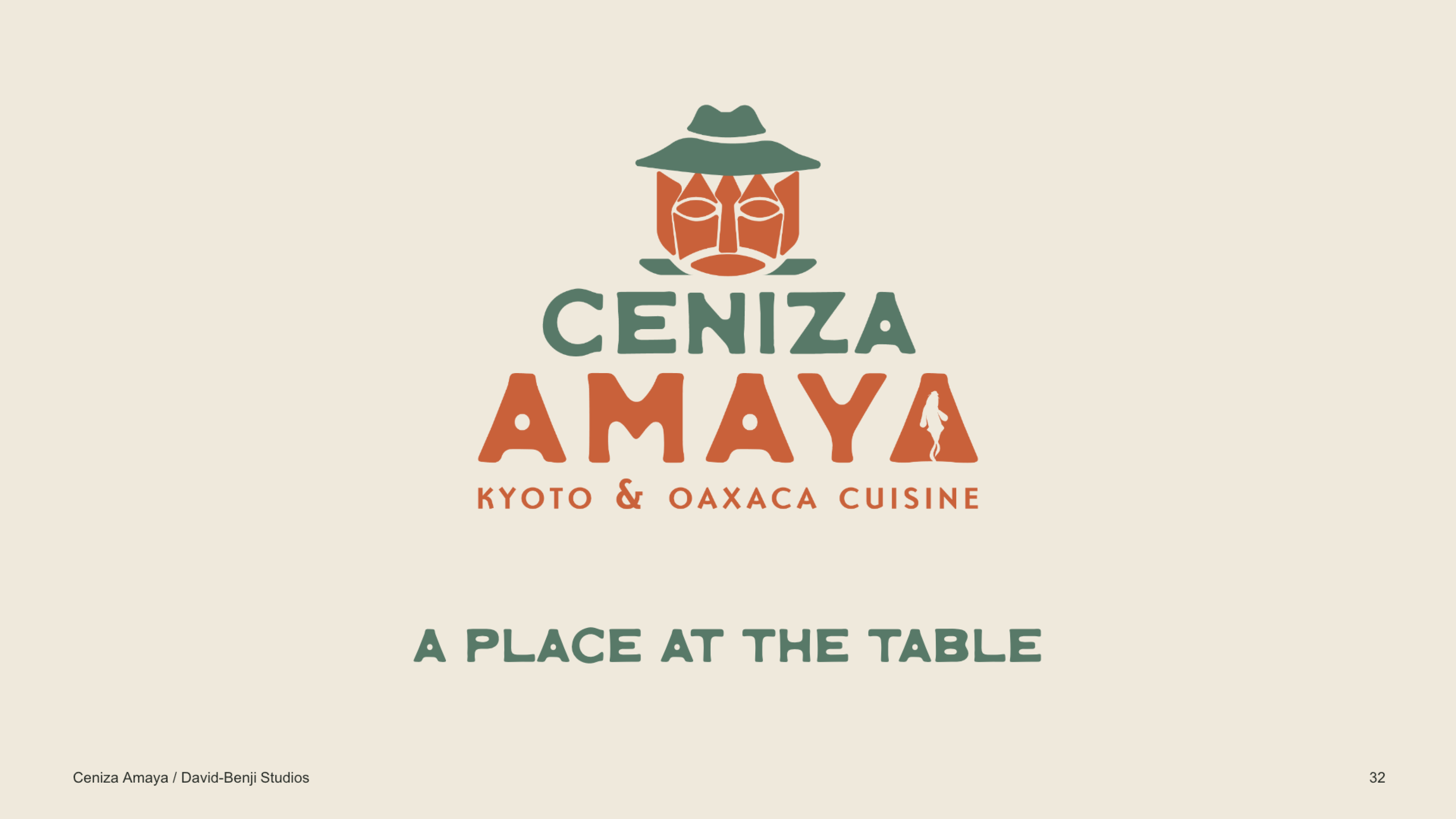
The identity began with pencil studies of Japanese stone lanterns, koi, agave, and mezcal workers. These explorations informed a symbol that combines agave with the figure of a mezcalero, enclosed within a silhouette inspired by a stone lantern. The mark connects the restaurant’s two influences in a single, distinctive form.
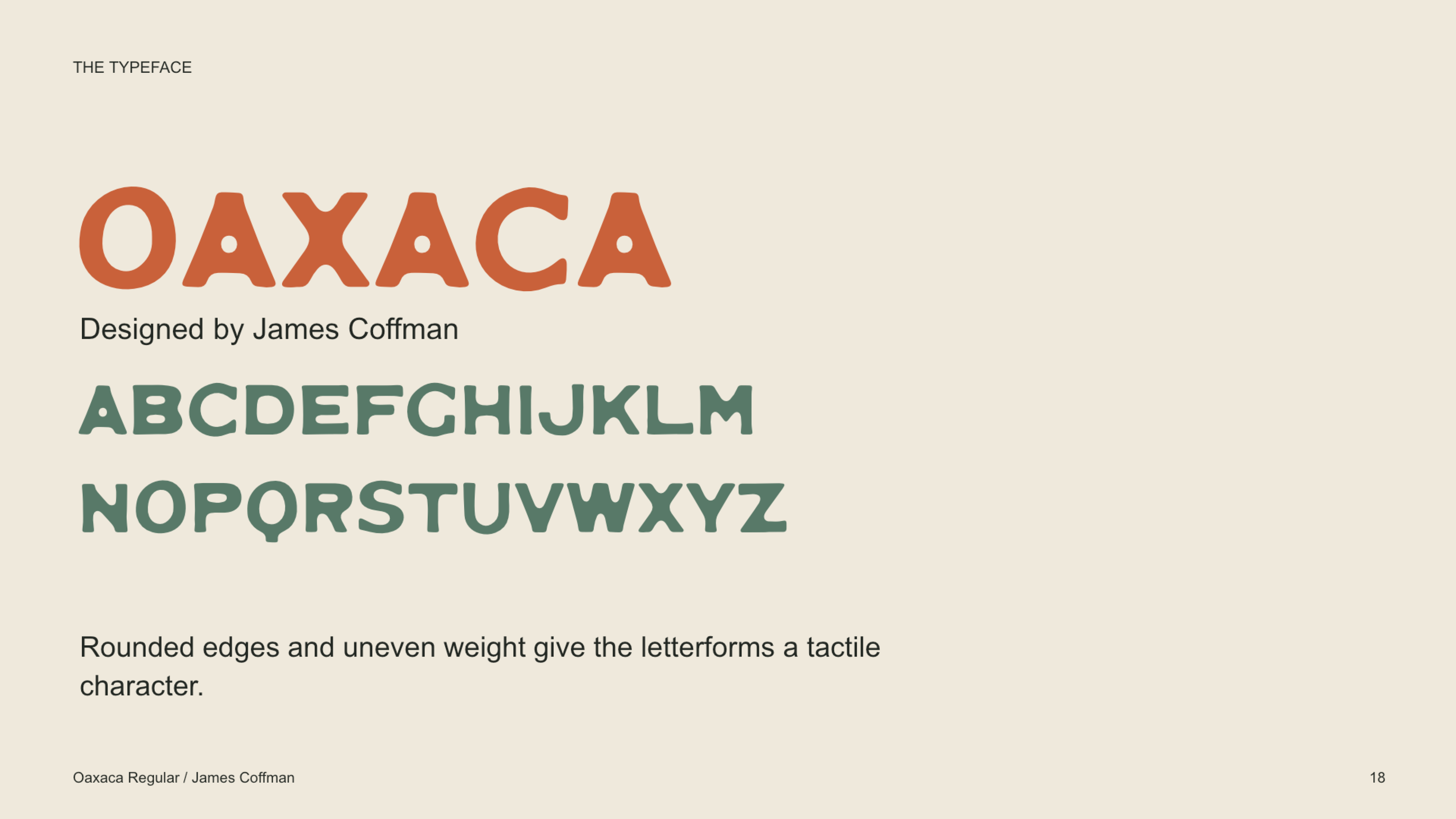
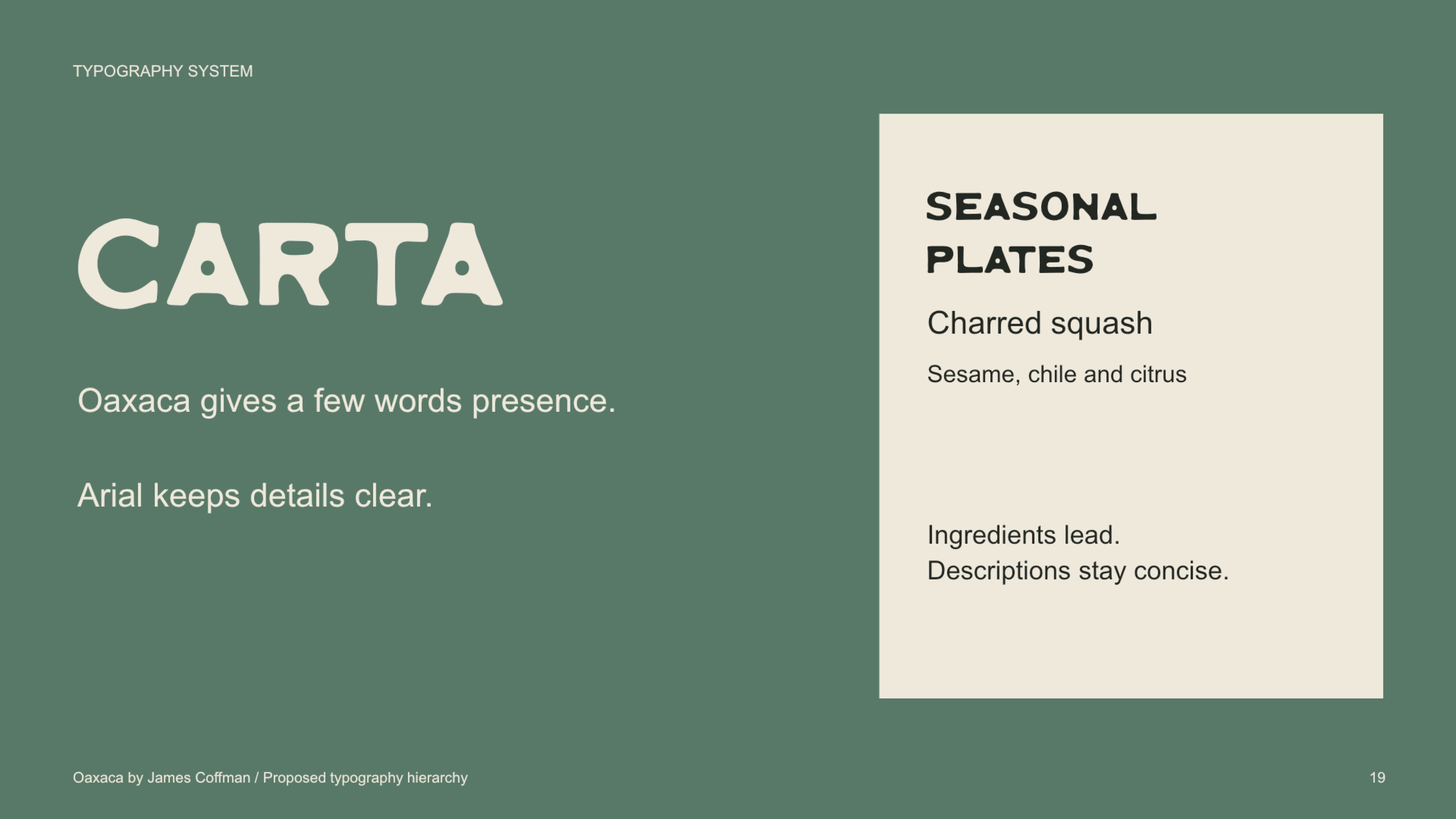
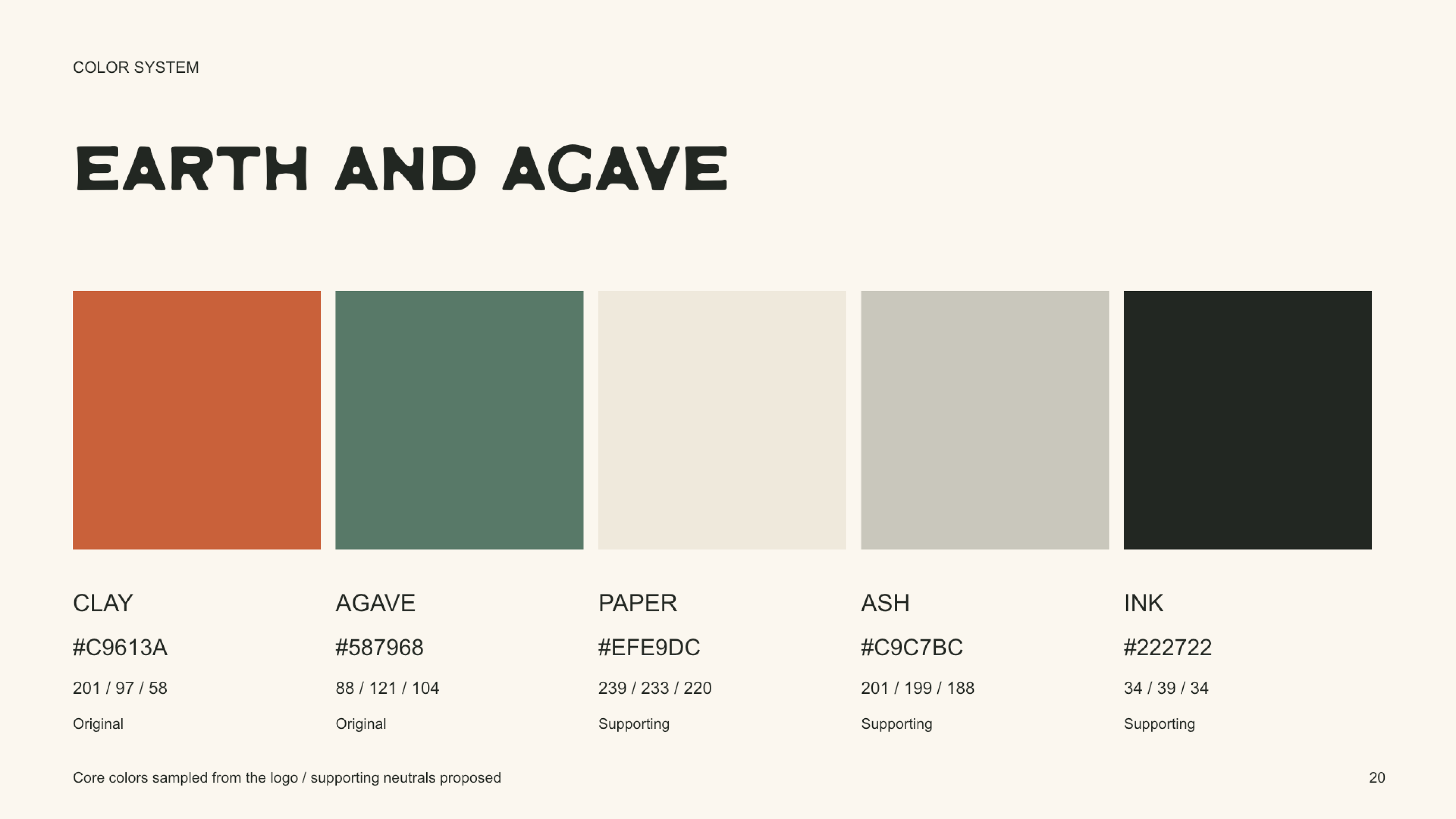
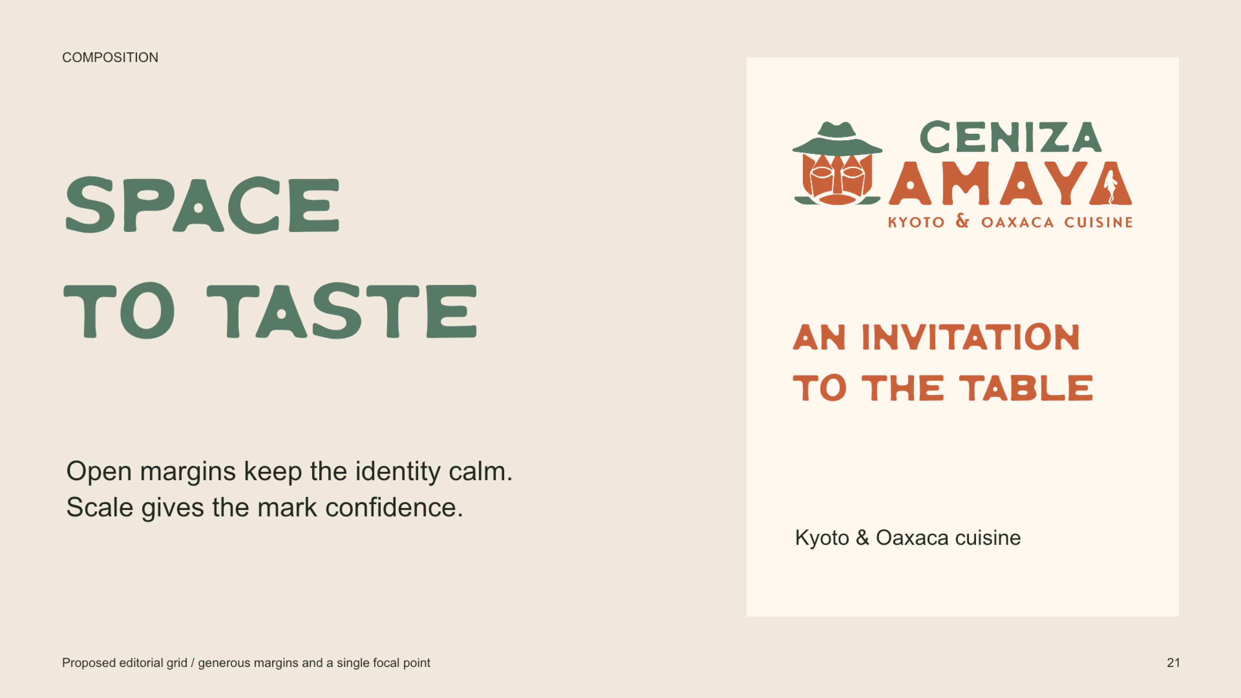
A palette of clay, agave green, and warm paper carries that character into the wider system. OAXACA, designed by James Coffman, anchors the typography, while generous spacing and restrained layouts give the expressive forms room to breathe.
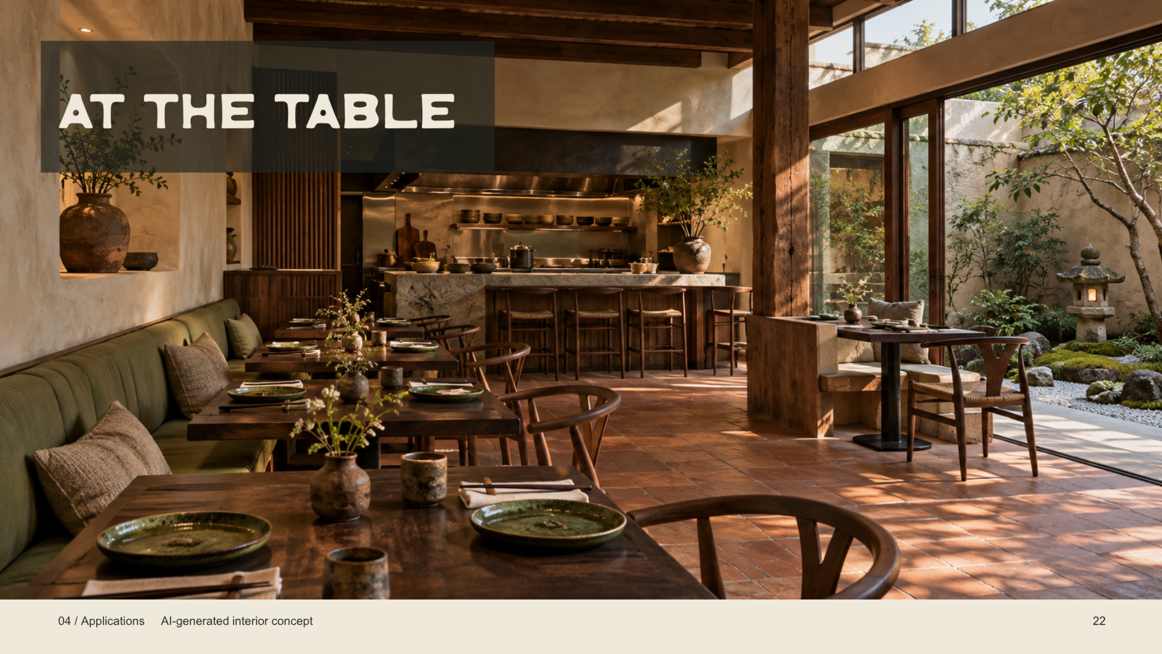
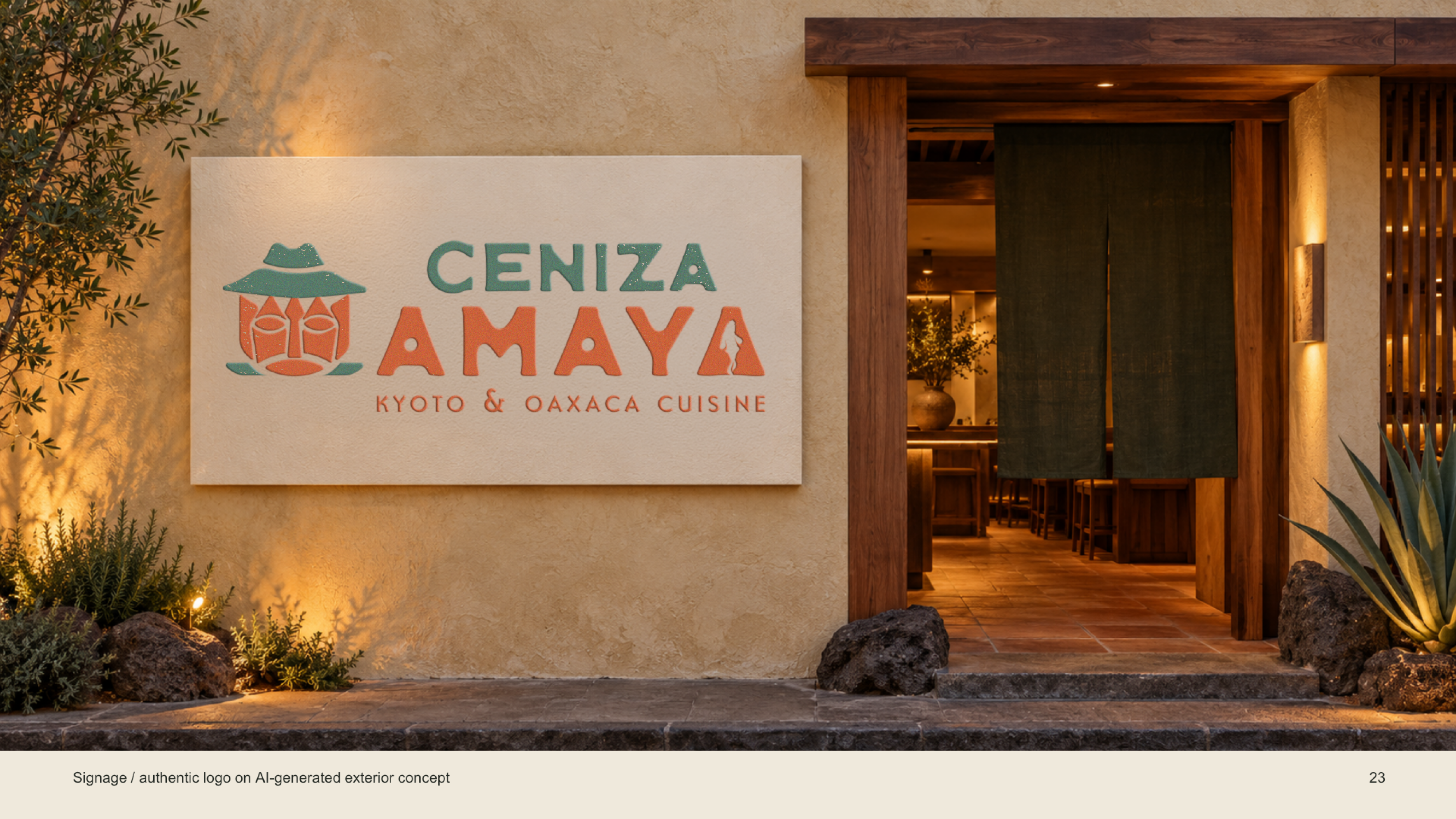
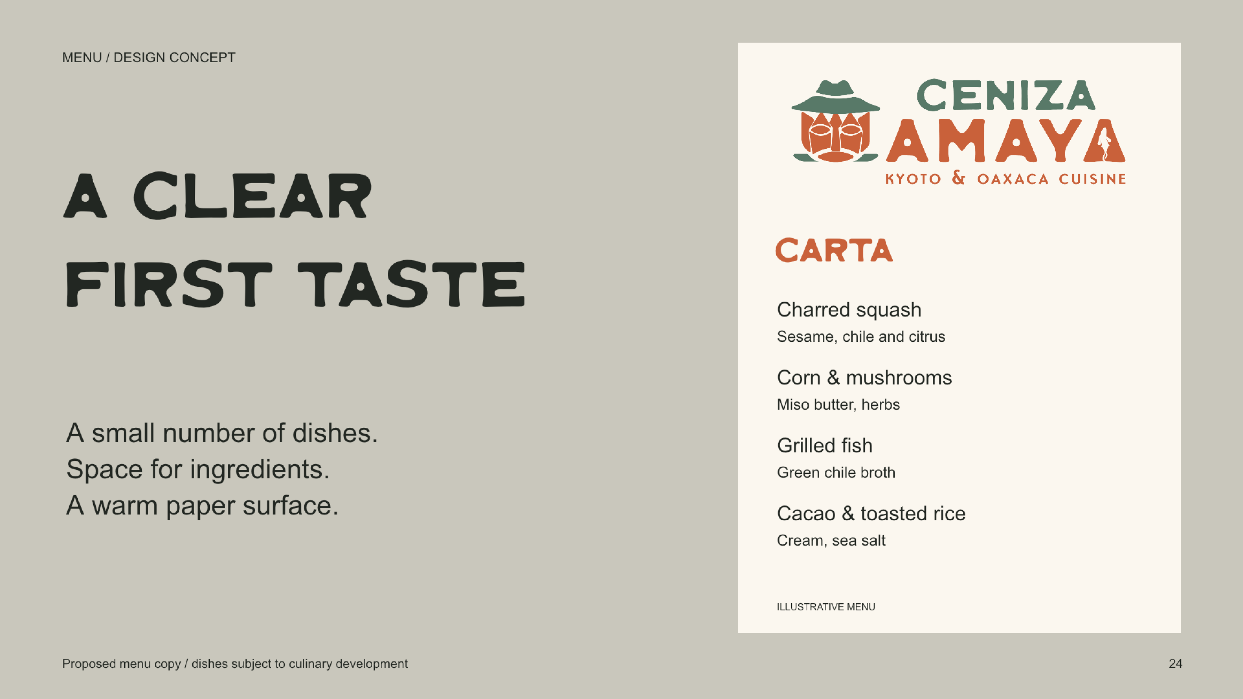
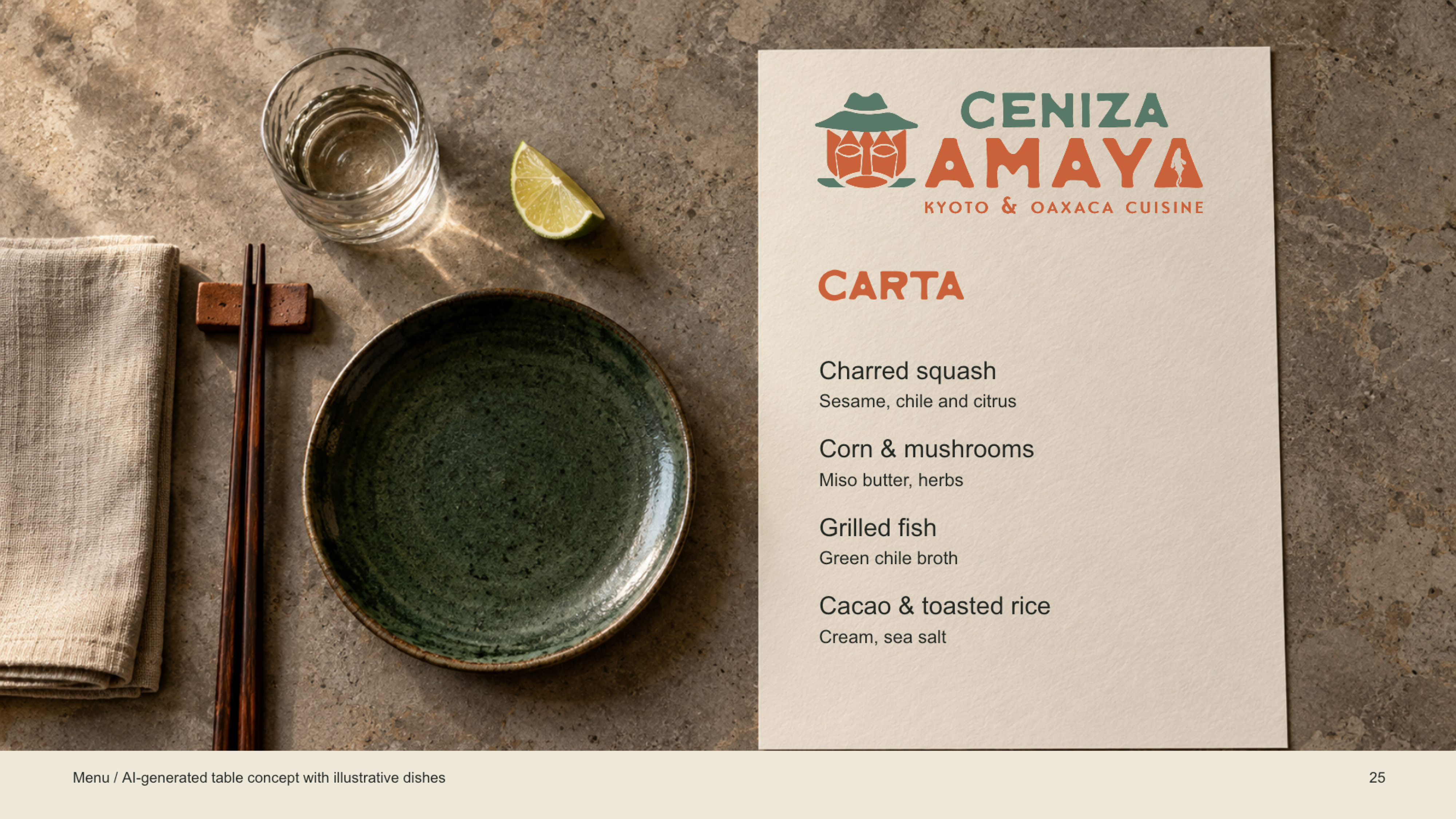
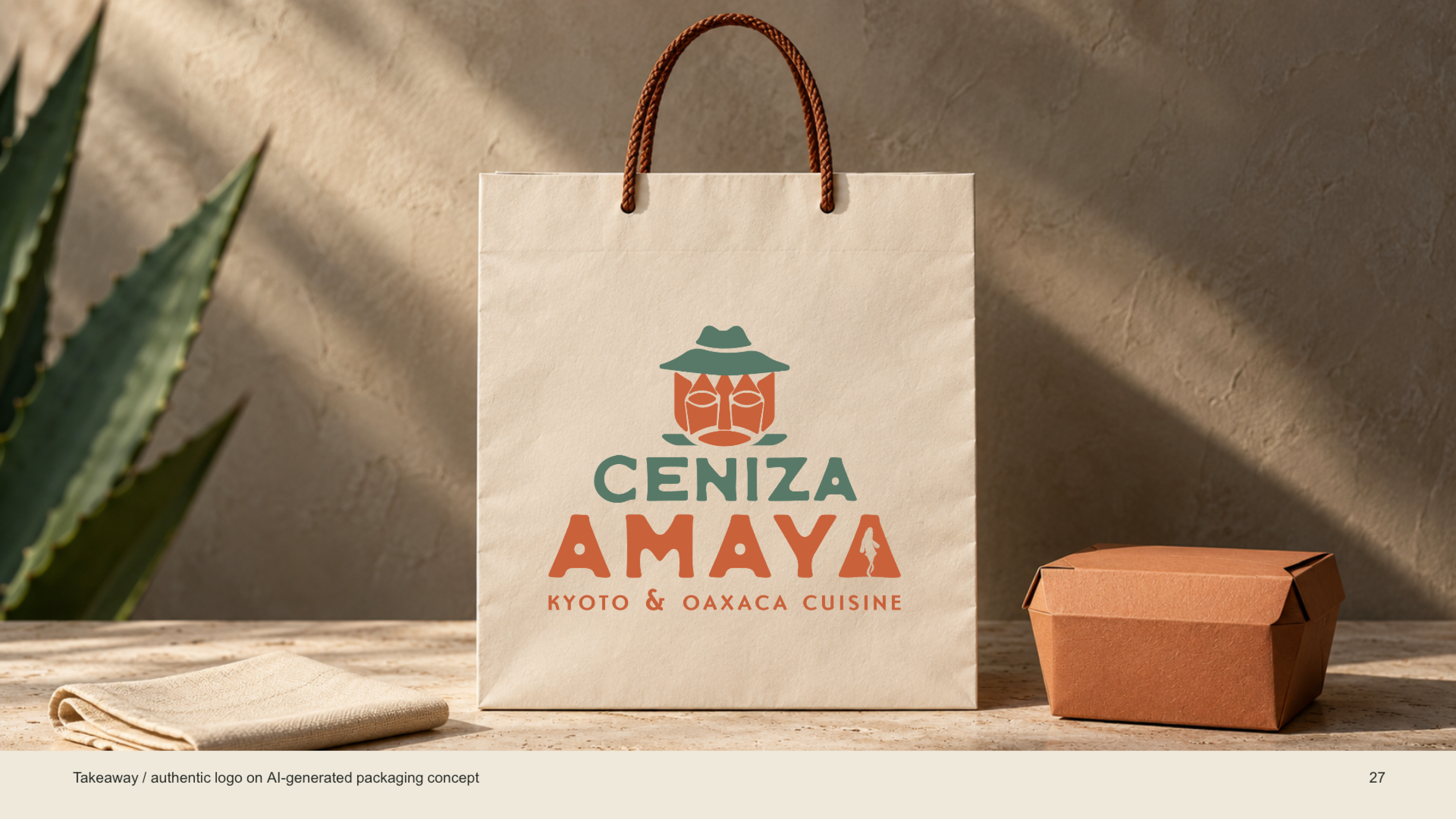
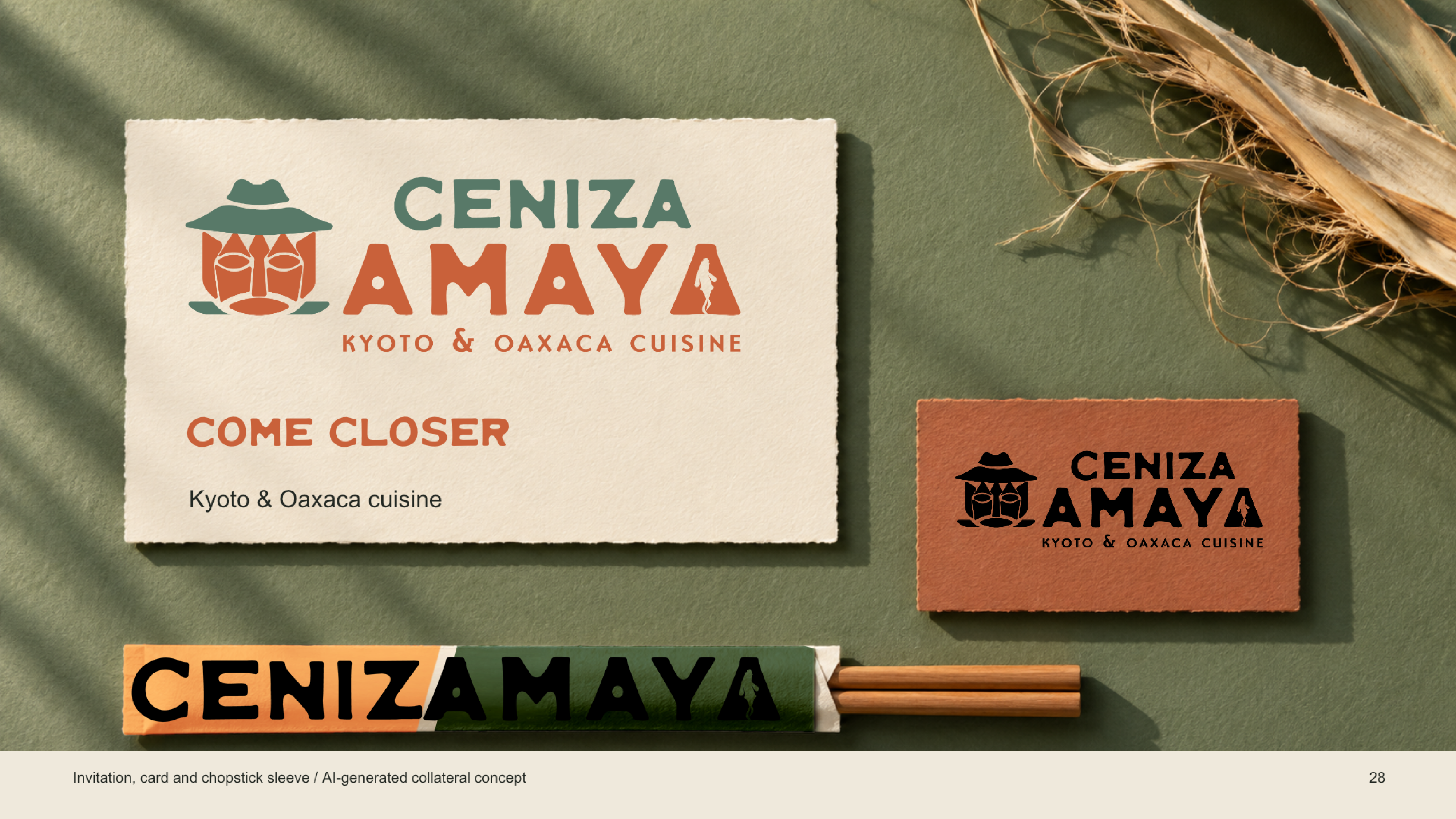
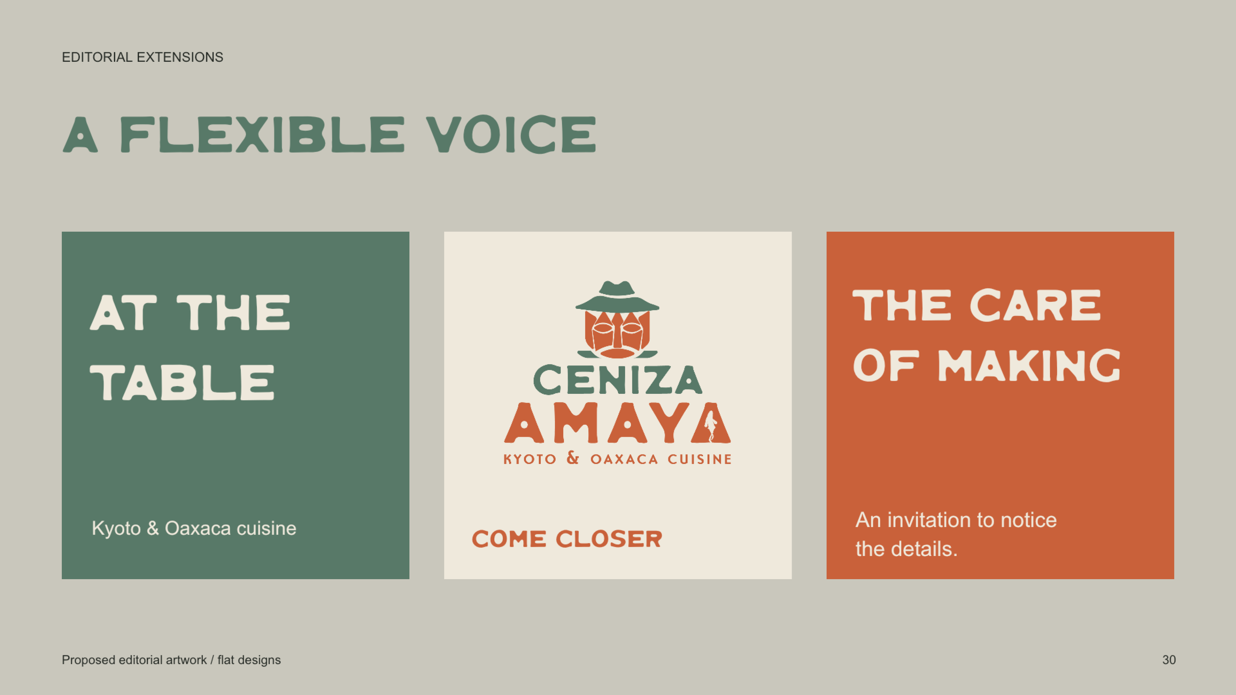
The case study follows the identity from research and original sketches through to proposed applications across signage, menus, packaging, and restaurant collateral.
Date
April 2025
Role
Designer

01
Ceniza Amaya

01

02

03

04

05

06

07

08

09

10

11

12

13

14

15

16

17

18

19

20

21

22

23

24

25

26

27

28

29

30

31

32

33
cenizaamaya34

34
35
bottom of page